How I Created Animated Choropleth Map and Running Bar Plot using Python
We will use animated Python visualizations to observe trends of state-wise forest cover over the years in India

Introduction
India is famous for its natural diversity and one of the most contributing factor to this diversity is, its forests. From the very childhood, however, I have been reading about deforestation and how it is affecting the environment. This made me curious on delving deeper into how forest cover has evolved over the years across the Indian states.
For this purpose we are utilising publicly available data [1]. As the data available here is spread into different links, we are cleaning the data and combining these. This will be followed by creating visualisation using this data. Visualisations explored in this article are (a) Choropleth map animation (b) Bar chart race. Let’s start by exploring the dataset and cleaning it.
Dataset
After a bit of browsing, I found this website [1] which had time-series data on state-wise forest coverage. As expected it was not in a readily available to use format, so it required some manipulations. These manipulations majorly fall in below categories:
- Data is spread into 4 files (1987–2013; 2017; 2019; 2021)
- Format of data in different sheets is not consistent
- Some states got split during 1987–2021 such as Bihar to Bihar and Jharkhand etc.
Cleaning and combining the data
Comments are provided in the script for explanation on steps.
Code
# Import necessary libraries
import os  # For working with the operating system
import pandas as pd  # For data manipulation and analysis
import numpy as np  # For numerical computations
import matplotlib.pyplot as plt  # For data visualization

# Reading an Excel file and creating a dictionary containing sheetnames
# and dataframes

# Read the Excel file 'indian_forest_cover.xlsx' into a dictionary
# of dataframes. We can do it by setting sheet_name = None. In such case,
# Each sheet in the Excel file will be stored as a separate dataframe.
data_dump_df = pd.read_excel('indian_forest_cover.xlsx',
                              sheet_name=None)

################### cleaning 1987-2013 dataframe ##########
# Get the dataframe for the year range 1987-2013 from the dictionary of
# dataframes
df_1987_2013 = data_dump_df.get('1987-2013')
df_1987_2013 = df_1987_2013.rename(columns={'Year':'State'})

# Replace '-' with NaN values in the dataframe
df_1987_2013 = df_1987_2013.replace('-', np.NaN)

# Set the 'State' column as the index of the dataframe
df_1987_2013.index = df_1987_2013['State']

# Drop the 'State' and 'Per cent' columns from the dataframe
df_1987_2013 = df_1987_2013.drop(['State', 'Per cent'], axis=1)


################### cleaning 2017 dataframe ##########
# Get the dataframe for the year 2017 from the dictionary of dataframes
df_2017 = data_dump_df.get('2017')

# Remove rows with all NaN values
df_2017 = df_2017.dropna(how='all', axis=0)

# Some of the other required manipulations
df_2017 = df_2017.drop(2).reset_index()
df_2017.columns = df_2017.iloc[0]
df_2017 = df_2017.drop(0)

# Rename columns 'States/UTs' to 'State' and 'Total' to '2017' and keeping
# only these two columns
df_2017 = df_2017.rename(columns={'States/UTs':'State', 'Total': 2017})
df_2017 = df_2017[['State', 2017]]

# Apply renaming for specific states (e.g., 'Orissa' to 'Odisha',
# 'Jammu & Kashmir*' to 'Jammu & Kashmir')
df_2017['State'] = df_2017['State'].apply(lambda x: 'Orissa'
                                          if x == 'Odisha' else x)
df_2017['State'] = df_2017['State'].apply(lambda x: 'Jammu & Kashmir'
                                          if x == 'Jammu & Kashmir*' else x)

# Set the 'State' column as the index of the dataframe
df_2017.index = df_2017['State']
df_2017 = df_2017.drop('State', axis=1)
df_2017[2017] = pd.to_numeric(df_2017[2017])

# Merge the cleaned 1987-2013 dataframe with the 2017 dataframe
# based on the index (outer join)
df_merged = df_1987_2013.merge(df_2017,
                               left_index=True,
                               right_index=True,
                               how='outer')


############### cleaning 2019 dataframe ############
# Get the dataframe for the year 2019 from the dictionary of dataframes
df_2019 = data_dump_df.get('2019')

# Performing some required manipulations
df_2019.columns = df_2019.iloc[1]
df_2019 = df_2019.drop([0, 1, 2])
df_2019 = df_2019.rename(columns={'States/UTs': 'State',
                                  'Total': 2019})
df_2019 = df_2019[['State', 2019]]

# Apply renaming for specific states (e.g., 'Orissa' to 'Odisha',
# 'Jammu & Kashmir#' to 'Jammu & Kashmir')
df_2019['State'] = df_2019['State'].apply(lambda x: 'Orissa'
                                          if x == 'Odisha' else x)
df_2019['State'] = df_2019['State'].apply(lambda x: 'Jammu & Kashmir'
                                          if x == 'Jammu & Kashmir#' else x)
df_2019.index = df_2019['State']
df_2019 = df_2019.drop('State', axis=1)

# Convert the '2019' column to numeric values
df_2019[2019] = pd.to_numeric(df_2019[2019])

# Merge the cleaned 1987-2013 and 2017 dataframes with the 2019
# dataframe based on the index (outer join)
df_merged = df_merged.merge(df_2019,
                            left_index=True,
                            right_index=True,
                            how='outer')


############### cleaning 2021 dataframe ############
# Get the dataframe for the year 2021 from the dictionary of dataframes
# and perform reqired manipulations
df_2021 = data_dump_df.get('2021')
df_2021.columns = df_2021.iloc[1]
df_2021 = df_2021.drop([0, 1, 2])
df_2021.columns.values[0] = 'State'
df_2021 = df_2021.rename(columns={'Scrub': 2021})
df_2021 = df_2021[['State', 2021]]

# Apply renaming for specific states (e.g., 'Orissa' to 'Odisha',
# 'Jammu & Kashmir#' to 'Jammu & Kashmir', 'Total' to 'Grand Total')
df_2021['State'] = df_2021['State'].apply(lambda x: 'Orissa'
                                          if x == 'Odisha' else x)
df_2021['State'] = df_2021['State'].apply(lambda x: 'Jammu & Kashmir'
                                          if x == 'Jammu & Kashmir#' else x)
df_2021['State'] = df_2021['State'].apply(lambda x: 'Grand Total'
                                          if x == 'Total' else x)

# Set the 'State' column as the index of the dataframe
df_2021.index = df_2021['State']

# Drop the 'State' column from the dataframe

# Lets make some assumptions by replacing Dadra and Nagar Haveli;
# Daman and Diu
# values by below steps - Dadra & Nagar Haveli -> last known value
# Daman & Diu -> combined value of (Dadra & Nagar Haveli and Daman & Diu) -
# Dadra & Nagar Haveli value assumed above
df_2021.loc['Dadra & Nagar Haveli'] = [207]

df_2021.loc['Daman & Diu']=df_2021.iloc[31][2021]-\
                           df_2021.loc['Dadra & Nagar Haveli']
df_2021[2021]=pd.to_numeric(df_2021[2021])

df_merged = df_merged.merge(df_2021,
                left_index=True,
                right_index=True,
                how='outer')

####################### Lets account for states which got split #############
# Transpose the DataFrame df_merged to have states as columns and years
# as rows
df_merged_t = df_merged.transpose()

# Combine data for 'Uttar Pradesh' by adding 'Uttarakhand'
# and filling NaN values with 0
df_merged_t['Uttar Pradesh'] = df_merged_t['Uttar Pradesh'] \
                                + df_merged_t['Uttarakhand'].fillna(0)

# Combine data for 'Bihar' by adding 'Jharkhand' and filling NaN values with 0
df_merged_t['Bihar'] = df_merged_t['Bihar'] + \
                       df_merged_t['Jharkhand'].fillna(0)

# Combine data for 'Madhya Pradesh' by adding 'Chhattisgarh'
# and filling NaN values with 0
df_merged_t['Madhya Pradesh'] = df_merged_t['Madhya Pradesh'] +\
                                df_merged_t['Chhattisgarh'].fillna(0)

# Combine data for 'Andhra Pradesh' by adding 'Telangana'
# and filling NaN values with 0
df_merged_t['Andhra Pradesh'] = df_merged_t['Andhra Pradesh'] +\
                                df_merged_t['Telangana'].fillna(0)

# Transpose the DataFrame back to its original shape
# with years as columns and states as rows
df_merged = df_merged_t.transpose()

# Convert all columns in df_merged to numeric data type
for col in df_merged.columns:
    df_merged[col] = pd.to_numeric(df_merged[col])
Output
Post (a) downloading data from website (b) cleaning and combining data for different years (c) handling states that got splitter, we get below time series data for each state:
Choropleth Animation
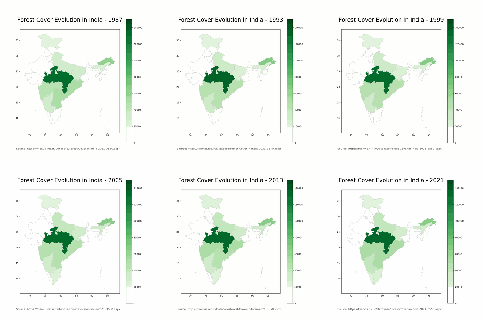
Choropleth visualisation is one of the most intuitive visualisations for showing geographical data. we utilise the geopandas library [2] in python. Below are the steps required for it:
- Get the shape file for Indian states [3]
- Read the shape file using geopandas
- merge geopandas data frame with state wise timeseries data
- Create image file for the individual years
- combine the image files to create gif
Next section contains the code required for this. Shape file source is provided in the references.
Code
import geopandas as gpd
import matplotlib.pyplot as plt

LINK = 'https://frienvis.nic.in/Database/Forest-Cover-in-India-2021_3550.aspx'

# Load the shapefile for India map using GeoPandas
map_df = gpd.read_file('./India Shape/india_st.shp')

# Create a new column 'state_caps' in df_merged with uppercase state names
df_merged['state_caps'] = df_merged.index.str.upper()

# Define a dictionary to handle state name mismatches
mismatches_dict = {
    'A & N ISLANDS': 'ANDAMAN AND NICOBAR ISLANDS',
    'DADRA & NAGAR HAVELI': 'DADRA AND NAGAR HAVELI',
    'DAMAN & DIU': 'DAMAN AND DIU',
    'JAMMU & KASHMIR': 'JAMMU AND KASHMIR',
    'PUDUCHERRY': 'PONDICHERRY'
}

# Apply the mismatches_dict to correct state name discrepancies
# in 'state_caps' column
df_merged['state_caps'] = df_merged['state_caps'].apply(lambda \
                          x: mismatches_dict.get(x) \
                          if mismatches_dict.get(x) else x)

# Merge the map_df and df_merged DataFrames based on the 'STATE'
# and 'state_caps' columns
map_df_forest_cover = map_df.merge(df_merged,
                                    left_on='STATE',
                                    right_on='state_caps',
                                    how='left').drop('state_caps',
                                                      axis=1)

# Define output path for saving map images
output_path = './images/'

# Set the color range for the maps
vmin, vmax = 0, 150000

# Initialize a counter
k = 1

# Start a for loop to create one map image per year
for col in map_df_forest_cover.columns[2:]:
    # Create a map using GeoPandas plot function
    fig = map_df_forest_cover.plot(column=col,
                                  cmap='Greens',
                                  figsize=(10, 10),
                                  linewidth=0.8,
                                  edgecolor='0.8',
                                  vmin=vmin,
                                  vmax=vmax,
                                  legend=True,
                                  norm=plt.Normalize(vmin=vmin,
                                  vmax=vmax))

    # Set map title and source annotation
    fig.set_title('Forest Cover Evolution in India - {}\n'.format(str(col)), \
                    fontdict={'fontsize': '25', 'fontweight': '3'})
    fig.annotate('Source: ' + LINK ,
                  xy=(0.1, .08),
                  xycoords='figure fraction',
                  horizontalalignment='left',
                  verticalalignment='top', fontsize=12,
                  color='#555555')

    # Save the map image to a file in the output path
    filepath = os.path.join(output_path,
                            'state_forest_cover_{}.png'.format(str(col)))
    chart = fig.get_figure()
    chart.savefig(filepath, dpi=100)
    k = k + 1
    plt.close()

# Import necessary libraries for creating a GIF
from PIL import Image
import glob

# Create a list of image frames
frames = []
imgs = glob.glob("./images/*.png")
imgs.sort(key=os.path.getmtime)
for i in imgs:
    new_frame = Image.open(i)
    frames.append(new_frame)

# Save the frames as a GIF file that loops forever
frames[0].save('./images/forest_cover_evolution.gif',
               format='GIF',
               append_images=frames[1:],
               save_all=True,
               duration=200, loop=0)
Output
Below is the animation created. Note that we are representing the absolute forest cover area in km².

Bar Chart Race
Although Choropleth diagram is good to reflect how the spread has changed over the years, we can add further context by seeing how the states are ranked vs each other in terms total forest cover area. A bar chart race [4] can even tell as how highest to lowest forest cover has changed over the years. Below are the steps followed for this:
- “Melt” the data frame to make the name of states as an attribute
- Utilise Plotly express to generate the Bar chart race
- Save it in html if you want to export it; To embed it to medium I have used plotly API (code snippet is provided below)
Code
# Create a new DataFrame 'df_' with the 'STATE' column and \
# forest cover data columns from map_df_forest_cover
df_ = pd.DataFrame(map_df_forest_cover[['STATE'] +\
               list(map_df_forest_cover.columns[2:])])

# Melt the DataFrame to convert it from wide format to long format
df_melted = df_.melt('STATE', var_name='year', value_name='Area')

# Import the Plotly Express library
import plotly.express as px

# Create a bar chart using Plotly Express
fig_bar = px.bar(df_melted,
             x="Area",
             y="STATE",
             color="STATE",
             animation_frame="year",
             animation_group="STATE",
             orientation='h',
             range_x=[0, 150000],
             title="Forest Cover Evolution in India (1987-2021)")

# Set the order of categories on the y-axis to be ascending
fig_bar.update_yaxes(categoryorder='total ascending')

# Remove grid lines on the x-axis
fig_bar.update_xaxes(showgrid=False)

# Remove hover text for individual data points
fig_bar.update_traces(hovertemplate=None)

# Configure layout settings for the bar chart
fig_bar.update_layout(
    margin=dict(t=70, b=0, l=70, r=40),
    hovermode="x unified",
    yaxis_tickangle=360,
    yaxis_title='State',
    xaxis_title="Forest Cover Area (km^2)",
    title_font=dict(size=25, color='#a5a7ab', family="Lato, sans-serif"),
    font=dict(color='#8a8d93')
)

# Hide the legend
fig_bar.update_layout(showlegend=False)

# Show the bar chart
fig_bar.show()

# Save the bar chart as an HTML file
fig_bar.write_html("./images/bar_chart_running.html")
# Replace 'Enter your plotly API_Key' with your actual Plotly API Key
API_KEY = "Enter your plotly API_Key"
# Import the necessary modules from the Chart Studio library
import chart_studio
# Set your Chart Studio credentials using your Plotly username and API Key
chart_studio.tools.set_credentials_file(username='your user id', api_key='2KHbmz9HzagVCQRsm6Yi')
# Configure the Chart Studio settings for the plot
chart_studio.tools.set_config_file(world_readable=True, sharing='public')
# Import the Plotly library
import chart_studio.plotly as py
# Assuming 'fig_bar' is a previously defined figure, plot it on Chart Studio
# with the filename 'forest_cover_evolution', and open the plot in a web browser
py.plot(fig_bar, filename='forest_cover_evolution', auto_open=True)Output
We can see that the bar chart changes for each year and shows the corresponding order changes.
Future Work
In above analysis, we downloaded and cleaned the data and utilised some intuitive visualisations to ge
nerate insights.Next, we could group the states based on the rate of change in the forest cover over the years. It’s possible to use existing sklearn libraries to perform this timeseries analysis.
References
- Forest cover data: https://frienvis.nic.in/Database/Forest-Cover-in-India-2021_3550.aspx
- Steps for using geopandas: https://www.youtube.com/watch?v=QMKBxDDMaIk
- Shape file for India: https://www.indiaremotesensing.com/2017/01/download-india-shapefile-with-official.html
- Plotly Bar chart Race: https://www.analyticsvidhya.com/blog/2021/07/construct-various-types-of-bar-race-charts-with-plotly/
If you found the explanation helpful, follow me for more content! Feel free to leave comments with any questions or suggestions you might have.
You can also check out other articles written around data science, computing on medium. If you like my work and want to contribute to my journey, you cal always buy me a coffee :)


Comments
Post a Comment