An Intuitive Approach to Time-Series Clustering
We will use silhouette score and few distance metrics to perform experiments on time-series clustering while leveraging intuitive visualisations
Introduction
Let us look at below time-series:

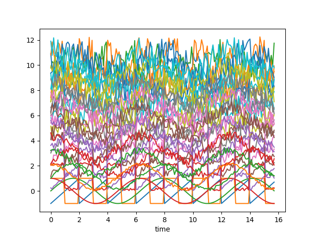
If we add random noise and distance from origin to shift the series along y axis and randomise these to make these almost indiscernible, it looks like below — now it’s very difficult to group the time-series columns into clusters:

Charts above are created using following script:
# Import necessary libraries
import os
import pandas as pd
import numpy as np

# Import random module with an alias 'rand'
import random as rand
from scipy import signal

# Import the matplotlib library for plotting
import matplotlib.pyplot as plt

# Generate an array 'x' ranging from 0 to 5*pi with a step of 0.1
x = np.arange(0, 5*np.pi, 0.1)

# Generate square, sawtooth, sin, and cos waves based on 'x'
y_square = signal.square(np.pi * x)
y_sawtooth = signal.sawtooth(np.pi * x)
y_sin = np.sin(x)
y_cos = np.cos(x)

# Create a DataFrame 'df_waves' to store the waveforms
df_waves = pd.DataFrame([x, y_sawtooth, y_square, y_sin, y_cos]).transpose()

# Rename the columns of the DataFrame for clarity
df_waves = df_waves.rename(columns={0: 'time',
                                    1: 'sawtooth',
                                    2: 'square',
                                    3: 'sin',
                                    4: 'cos'})

# Plot the original waveforms against time
df_waves.plot(x='time', legend=False)
plt.show()

# Add noise to the waveforms and plot them again
for col in df_waves.columns:
    if col != 'time':
        for i in range(1, 10):
            # Add noise to each waveform based on 'i' and a random value
            df_waves['{}_{}'.format(col, i)] = df_waves[col].apply(lambda x: x + i + rand.random() * 0.25 * i)

# Plot the waveforms with added noise against time
df_waves.plot(x='time', legend=False)
plt.show()
Problem statement
Now we need to decide the basis of our clustering. There could be two approaches:
- We want to group waveforms which are closer to one group — lower euclidean distance waveforms will be clubbed together.
- We want to group waveforms which look similar — they have similar shapes but euclidean distance might not be low
Distance metrics
Generally, we want to group the time-series based on the shapes (2) and for such a clustering — we might want to use distance metrics such as correlation which are more or less independent of linear shift of waveforms.
Lets check out the heatmaps of euclidean distance and correlation among the pairs of waveforms with noise defined above:
Silhouette Score
Analysing heat maps shown above and assigning groups based on the high correlation looks to be a good idea but how do we define the correlation threshold above which we should be grouping time-series. Looks like an iterative process, prone to inaccuracies and significant manual effort.
In such a scenario, we can utilise Silhouette score which assigns a score to the clustering performed. Our goal is to maximise the Silhouette score. How does Silhouette score work — although that might need a seperate discussion altogether — let’s review a high level definition
- Silhouette Score Calculation: The silhouette score for a single data point is calculated by comparing its similarity to points in its own cluster (a measure called “a”) with its similarity to points in the nearest cluster that the point is not a part of (a measure called “b”). The silhouette score for that point is then given by (b — a) / max(a, b).
- a (Cohesion): Measures how similar the point is to other points in its own cluster. Higher “a” indicates that the point is well-placed within its cluster.
- b (Separation): Measures how dissimilar the point is to points in the nearest neighboring cluster. Lower “b” indicates that the point is far from points in the nearest cluster.
- The silhouette score ranges from -1 to 1, where a high value (close to 1) indicates that the point is well-clustered, and a low value (close to -1) indicates that the point may be in the wrong cluster.
2. Interpreting Silhouette Score:
- A high average silhouette score (closer to 1) across all points indicates well-defined and distinct clusters.
- A low or negative average silhouette score (closer to -1) suggests overlapping or poorly formed clusters.
- A score around 0 indicates that the point is on the boundary between two clusters.
Clustering
Let’s now utilise the two versions of distance metrics computed above and try to group the time-series based while leveraging Silhouette score. It’s easier to test the results as we already know that there exists four different waveforms and hence ideally there should be four clusters.
Euclidean distance
############ reduing components on eucl distance metrics for visualisation #######
pca = decomposition.PCA(n_components=2)
pca.fit(df_man_dist_euc)
df_fc_cleaned_reduced_euc = pd.DataFrame(pca.transform(df_man_dist_euc).transpose(),
                                              index = ['PC_1','PC_2'],
                                              columns = df_man_dist_euc.transpose().columns)

index = 0
range_n_clusters = [2, 3, 4, 5, 6, 7, 8]

# Iterate over different cluster numbers
for n_clusters in range_n_clusters:
    # Create a subplot with silhouette plot and cluster visualization
    fig, (ax1, ax2) = plt.subplots(1, 2)
    fig.set_size_inches(15, 7)

    # Set the x and y axis limits for the silhouette plot
    ax1.set_xlim([-0.1, 1])
    ax1.set_ylim([0, len(df_man_dist_euc) + (n_clusters + 1) * 10])

    # Initialize the KMeans clusterer with n_clusters and random seed
    clusterer = KMeans(n_clusters=n_clusters, n_init="auto", random_state=10)
    cluster_labels = clusterer.fit_predict(df_man_dist_euc)

    # Calculate silhouette score for the current cluster configuration
    silhouette_avg = silhouette_score(df_man_dist_euc, cluster_labels)
    print("For n_clusters =", n_clusters, "The average silhouette_score is :", silhouette_avg)
    sil_score_results.loc[index, ['number_of_clusters', 'Euclidean']] = [n_clusters, silhouette_avg]
    index += 1

    # Calculate silhouette values for each sample
    sample_silhouette_values = silhouette_samples(df_man_dist_euc, cluster_labels)

    y_lower = 10

    # Plot the silhouette plot
    for i in range(n_clusters):
        # Aggregate silhouette scores for samples in the cluster and sort them
        ith_cluster_silhouette_values = sample_silhouette_values[cluster_labels == i]
        ith_cluster_silhouette_values.sort()

        # Set the y_upper value for the silhouette plot
        size_cluster_i = ith_cluster_silhouette_values.shape[0]
        y_upper = y_lower + size_cluster_i

        color = cm.nipy_spectral(float(i) / n_clusters)

        # Fill silhouette plot for the current cluster
        ax1.fill_betweenx(np.arange(y_lower, y_upper), 0, ith_cluster_silhouette_values, facecolor=color, edgecolor=color, alpha=0.7)

        # Label the silhouette plot with cluster numbers
        ax1.text(-0.05, y_lower + 0.5 * size_cluster_i, str(i))
        y_lower = y_upper + 10  # Update y_lower for the next plot

    # Set labels and title for the silhouette plot
    ax1.set_title("The silhouette plot for the various clusters.")
    ax1.set_xlabel("The silhouette coefficient values")
    ax1.set_ylabel("Cluster label")

    # Add vertical line for the average silhouette score
    ax1.axvline(x=silhouette_avg, color="red", linestyle="--")
    ax1.set_yticks([])  # Clear the yaxis labels / ticks
    ax1.set_xticks([-0.1, 0, 0.2, 0.4, 0.6, 0.8, 1])

    # Plot the actual clusters
    colors = cm.nipy_spectral(cluster_labels.astype(float) / n_clusters)
    ax2.scatter(df_fc_cleaned_reduced_euc.transpose().iloc[:, 0], df_fc_cleaned_reduced_euc.transpose().iloc[:, 1],
                marker=".", s=30, lw=0, alpha=0.7, c=colors, edgecolor="k")

    # Label the clusters and cluster centers
    centers = clusterer.cluster_centers_
    ax2.scatter(centers[:, 0], centers[:, 1], marker="o", c="white", alpha=1, s=200, edgecolor="k")

    for i, c in enumerate(centers):
        ax2.scatter(c[0], c[1], marker="$%d$" % i, alpha=1, s=50, edgecolor="k")

    # Set labels and title for the cluster visualization
    ax2.set_title("The visualization of the clustered data.")
    ax2.set_xlabel("Feature space for the 1st feature")
    ax2.set_ylabel("Feature space for the 2nd feature")

    # Set the super title for the whole plot
    plt.suptitle("Silhouette analysis for KMeans clustering on sample data with n_clusters = %d" % n_clusters,
                 fontsize=14, fontweight="bold")

plt.savefig('sil_score_eucl.png')
plt.show()


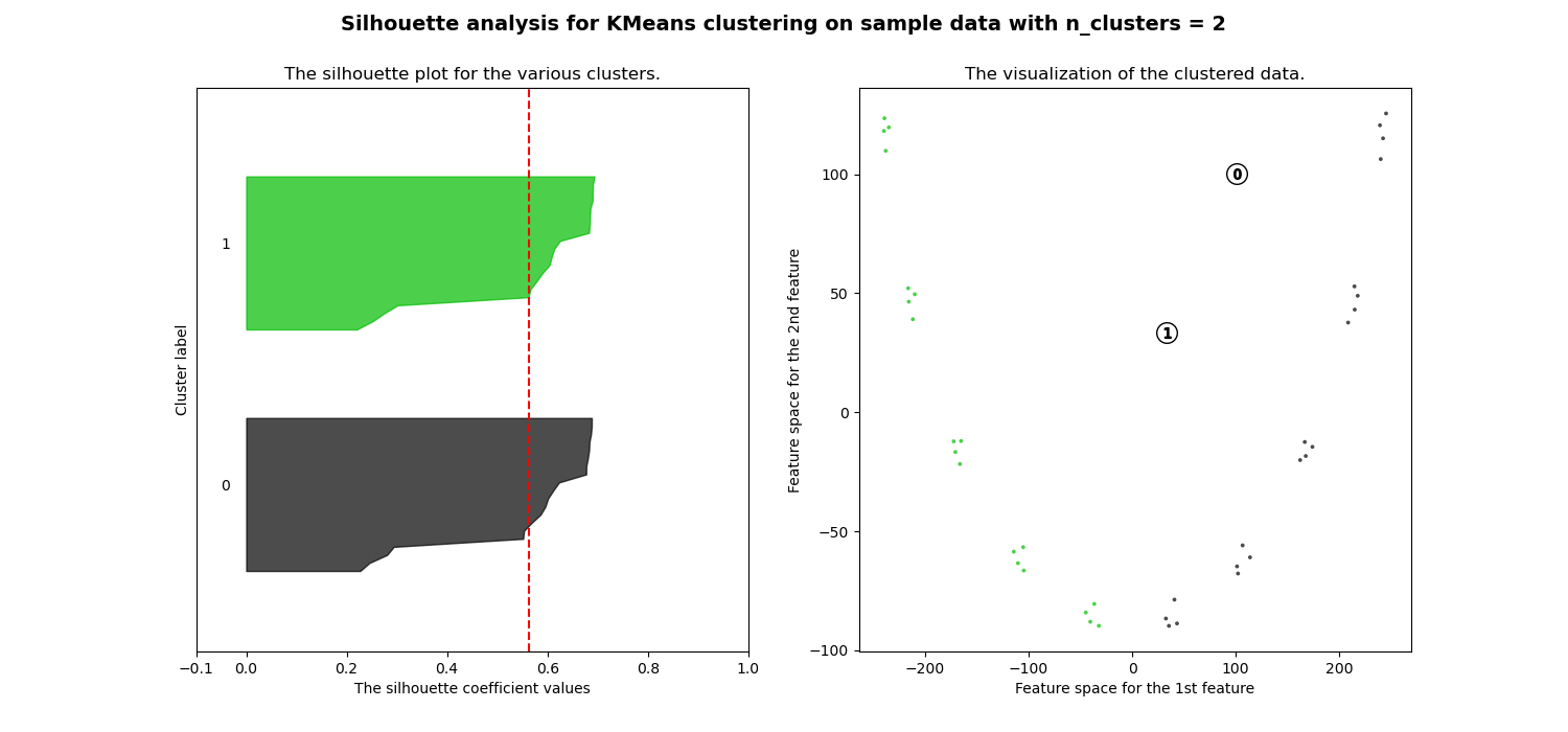
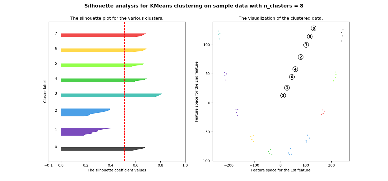
It’s quite clear that clusters are all mixed up and do not provide good silhouette score for any number of clusters. This is in line with expectation from our initial assessment based on euclidean distance heatmap
Correlation
############ reduing components on eucl distance metrics for visualisation #######
pca = decomposition.PCA(n_components=2)
pca.fit(df_man_dist_corr)
df_fc_cleaned_reduced_corr = pd.DataFrame(pca.transform(df_man_dist_corr).transpose(),
                                              index = ['PC_1','PC_2'],
                                              columns = df_man_dist_corr.transpose().columns)

index=0
range_n_clusters = [2,3,4,5,6,7,8]
for n_clusters in range_n_clusters:
    # Create a subplot with 1 row and 2 columns
    fig, (ax1, ax2) = plt.subplots(1, 2)
    fig.set_size_inches(15, 7)

    # The 1st subplot is the silhouette plot
    # The silhouette coefficient can range from -1, 1 but in this example all
    # lie within [-0.1, 1]
    ax1.set_xlim([-0.1, 1])
    # The (n_clusters+1)*10 is for inserting blank space between silhouette
    # plots of individual clusters, to demarcate them clearly.
    ax1.set_ylim([0, len(df_man_dist_corr) + (n_clusters + 1) * 10])

    # Initialize the clusterer with n_clusters value and a random generator
    # seed of 10 for reproducibility.
    clusterer = KMeans(n_clusters=n_clusters, n_init="auto", random_state=10)
    cluster_labels = clusterer.fit_predict(df_man_dist_corr)

    # The silhouette_score gives the average value for all the samples.
    # This gives a perspective into the density and separation of the formed
    # clusters
    silhouette_avg = silhouette_score(df_man_dist_corr, cluster_labels)
    print(
        "For n_clusters =",
        n_clusters,
        "The average silhouette_score is :",
        silhouette_avg,
    )
    sil_score_results.loc[index,['number_of_clusters','corrlidean']] = [n_clusters,silhouette_avg]
    index=index+1

    sample_silhouette_values = silhouette_samples(df_man_dist_corr, cluster_labels)

    y_lower = 10
    for i in range(n_clusters):
        # Aggregate the silhouette scores for samples belonging to
        # cluster i, and sort them
        ith_cluster_silhouette_values = sample_silhouette_values[cluster_labels == i]

        ith_cluster_silhouette_values.sort()

        size_cluster_i = ith_cluster_silhouette_values.shape[0]
        y_upper = y_lower + size_cluster_i

        color = cm.nipy_spectral(float(i) / n_clusters)
        ax1.fill_betweenx(
            np.arange(y_lower, y_upper),
            0,
            ith_cluster_silhouette_values,
            facecolor=color,
            edgecolor=color,
            alpha=0.7,
        )

        # Label the silhouette plots with their cluster numbers at the middle
        ax1.text(-0.05, y_lower + 0.5 * size_cluster_i, str(i))

        # Compute the new y_lower for next plot
        y_lower = y_upper + 10  # 10 for the 0 samples

    ax1.set_title("The silhouette plot for the various clusters.")
    ax1.set_xlabel("The silhouette coefficient values")
    ax1.set_ylabel("Cluster label")

    # The vertical line for average silhouette score of all the values
    ax1.axvline(x=silhouette_avg, color="red", linestyle="--")

    ax1.set_yticks([])  # Clear the yaxis labels / ticks
    ax1.set_xticks([-0.1, 0, 0.2, 0.4, 0.6, 0.8, 1])

    # 2nd Plot showing the actual clusters formed
    colors = cm.nipy_spectral(cluster_labels.astype(float) / n_clusters)

    ax2.scatter(
        df_fc_cleaned_reduced_corr.transpose().iloc[:, 0],
        df_fc_cleaned_reduced_corr.transpose().iloc[:, 1], marker=".", s=30, lw=0, alpha=0.7, c=colors, edgecolor="k"
    )

#     for i in range(len(df_fc_cleaned_cleaned_reduced.transpose().iloc[:, 0])):
#                         ax2.annotate(list(df_fc_cleaned_cleaned_reduced.transpose().index)[i],
#                                      (df_fc_cleaned_cleaned_reduced.transpose().iloc[:, 0][i],
#                                       df_fc_cleaned_cleaned_reduced.transpose().iloc[:, 1][i] + 0.2))

    # Labeling the clusters
    centers = clusterer.cluster_centers_
    # Draw white circles at cluster centers
    ax2.scatter(
        centers[:, 0],
        centers[:, 1],
        marker="o",
        c="white",
        alpha=1,
        s=200,
        edgecolor="k",
    )

    for i, c in enumerate(centers):
        ax2.scatter(c[0], c[1], marker="$%d$" % i, alpha=1, s=50, edgecolor="k")

    ax2.set_title("The visualization of the clustered data.")
    ax2.set_xlabel("Feature space for the 1st feature")
    ax2.set_ylabel("Feature space for the 2nd feature")

    plt.suptitle(
        "Silhouette analysis for KMeans clustering on sample data with n_clusters = %d"
        % n_clusters,
        fontsize=14,
        fontweight="bold",
    )

plt.show()


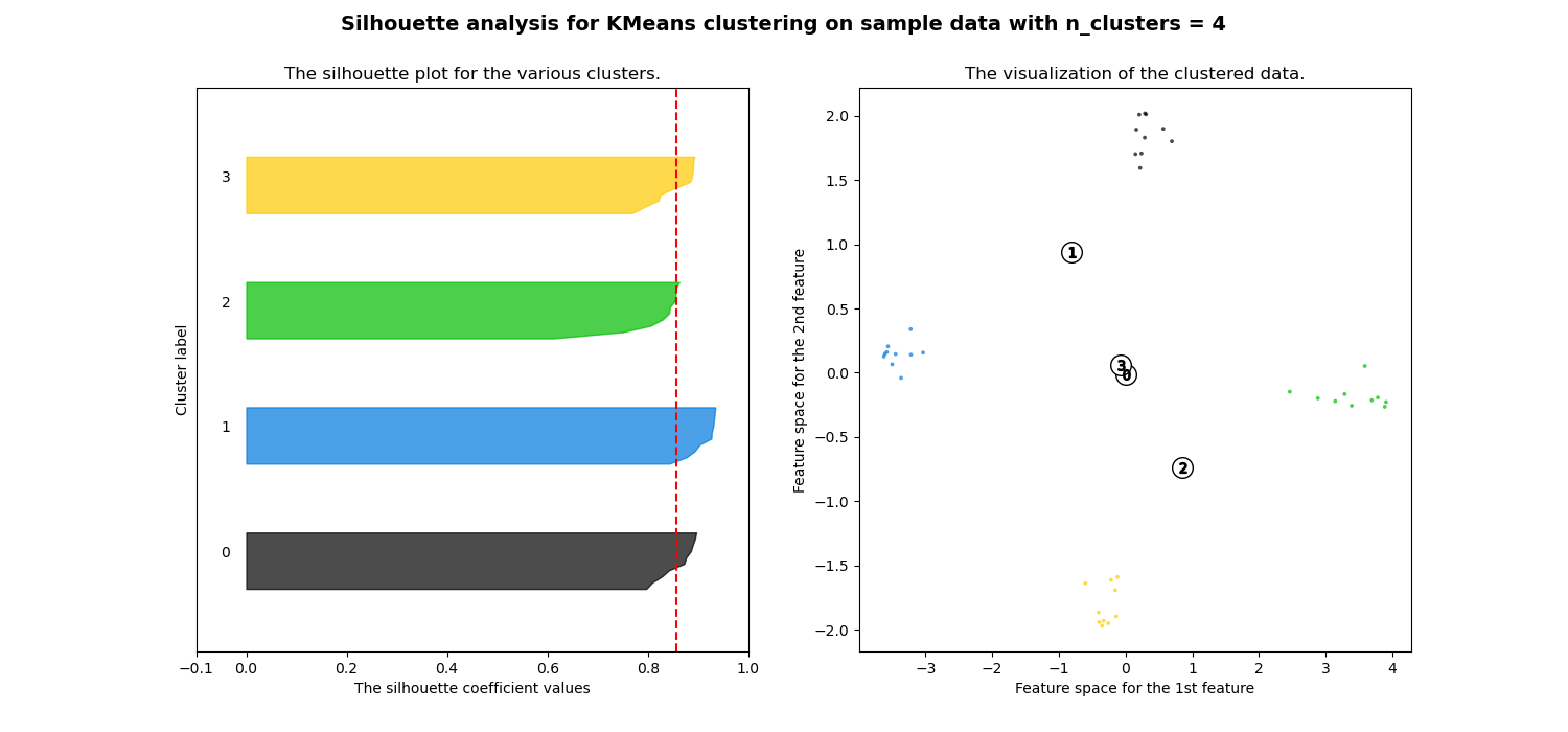
We can see clearly separated clusters when number of clusters selected is 4 and results are generally much be
tter than Euclidean distance.Comparison between Euclidean distance and Correlation Silhouette scores

Silhouette score signifies that correlation based distance matrix provides a best results when number of clusters are 4 where as its not so clear in case of Euclidean distance
Conclusion
In this article we looked at how time-series clustering can be performed using Euclidean distance and correlation metrics and we also observed how results vary in both the cases. We can make our clustering steps much more objective if we incorporate Silhouette while assessing the clusters as it provides a good intuitive way to see how well separated clusters are.
References
- https://scikit-learn.org [For KMeans & Silhouette score]
- https://plotly.com/ [visualisation lib]
- https://scipy.org [For creating signal data]
- https://github.com/girish9851/time_series_clustering/blob/main/timeseries_analysis-Copy1.ipynb [Jupyter notebook link]
If you found the explanation helpful, follow me for more content! Feel free to leave comments with any questions or suggestions you might have.
You can also check out other articles written around data science, computing on medium. If you like my work and want to contribute to my journey, you cal always buy me a coffee :)


Comments
Post a Comment